Jake Berman makes better transit maps. I found this beautiful late-night subway service map of his on the New York City Subway Wikipedia article.
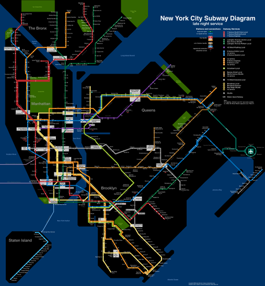
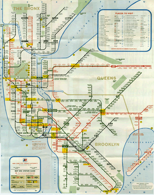
It reminded me of the famous 1972 Massimo Vignelli map which hangs in my kitchen, but turns out it’s primarily influenced by the relatively obscure 1966 system map. That map is notable for the way its line curves match the street grid.
This reminded me of the KickMap by Kick Design, which takes a similar hybrid approach in its attempt to display the entire subway system and its relation to the city as cleanly as possible. The KickMap is stylized for clarity but its stations are location-accurate and a comprehensive street grid is used.
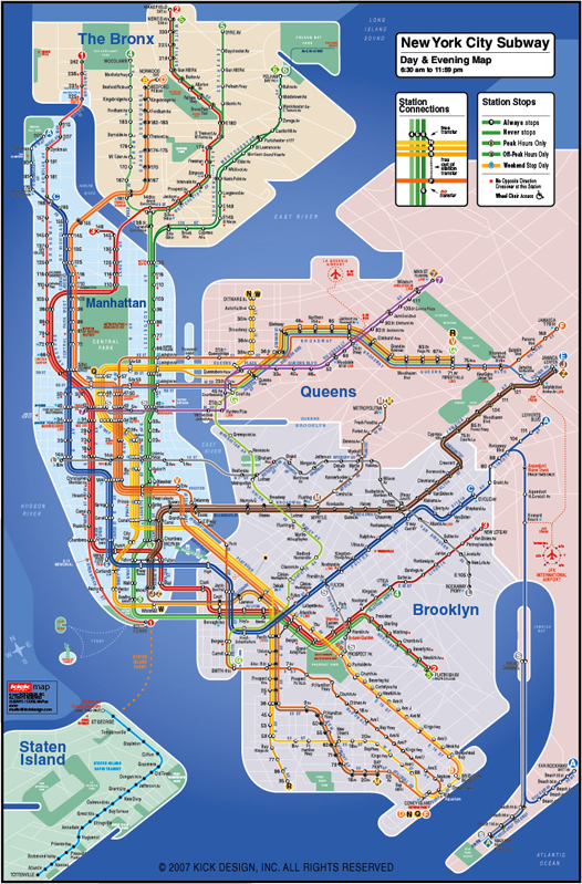
The KickMap is I think the most successful current map of the amazingly complex New York City subway system (the MTA thought otherwise), and you can put it on your iPhone.
Berman also uploaded this 1939 map of the never-built IND Second System, which would have put a subway stop within a half-mile of anyone’s home in New York City. They’re just getting around to construction of the Second Avenue line proposed then.
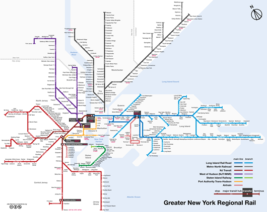
But much of Berman’s efforts lately seem to be focused on creating maps of entire city transit systems, particularly in areas served by different transit agencies that ignore one another. Here’s a map combining the regional commuter rail lines of Greater New York:
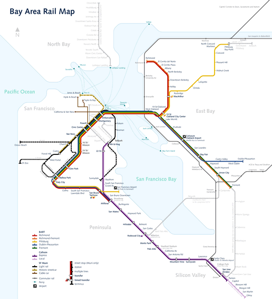
And here’s San Francisco’s complete rail system (BART, CalTrain and SF Muni united! Downloading this now because this always baffles me when I visit):
UPDATE: Jacob’s got an Etsy shop now.