The product page—that all-important detail page on an ecommerce site where you purchase a product—is an undervalued content format. I see a huge variety of them nowadays but only a few really good ones, and bad practices are rampant. I’ve posted before about what I think matters in a product page (in brief: high-quality photos, clarity, personality and shareability), and thought I’d share a few examples of good ones I’ve come across in the wild recently.
1. Huckberry
Huckberry is “like your favorite store and magazine rolled into one.” They sell adventure gear and manly things (without ever using that qualifier) and have some people really very excited. They won me over enough to sign up for their “awesome + infrequent email” with some content of theirs that someone I know somewhere shared about two of my favorite things: furniture design and Block Island. Their product pages contain lots of information and lots of photos—both close-up product shots and editorial “lifestyle” photos of the product in action—all laid out like a blog post, with blocks of text broken up by eye-catching imagery.

They generally start with the story of the brand behind the product (in this case, a great one I first discovered on Wanelo), which gives you some context and sets you up to care about the details. Then they get into the product specs in between some action shots, and often devote a paragraph to why they love the thing. The latter section usually contains some useful information, like in the case of this Topo Designs Trip Pack:
Why we love this:
It’s the perfect travel bag (and perfect Travel Bag companion). It fits under the seat on a plane, or it’s great for carrying a few things while tooling around town or on the trail. It’s got all the functionality of a daypack in a light, compact size. The Trip Bag features an external zippered pocket and an internal sleeve with zippered pocket that’s perfect for an iPad or travel journal. Best of all it works with the Travel Bag by simply hooking the integrated webbing loops to the aluminum hooks on the front. The hooks allow both bags to be carried at once and disassembled when you reach your destination.
At the bottom of the post, after you’ve scrolled down and thought about the product from a few different angles, they tell you your estimated delivery date so you can get an immediate sense of when it can be yours, followed by the return policy in one sentence. Finally, the buy button and price is always in its own clear section, bold and large and above the product content.
2. The Line
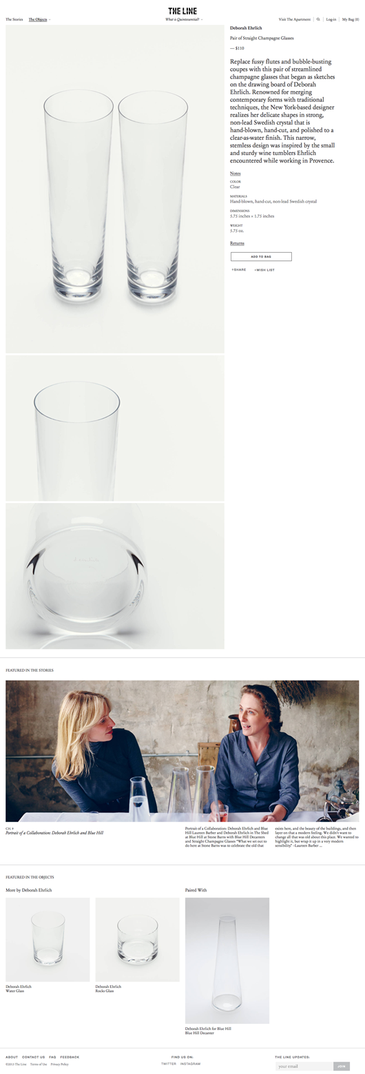
The Line is another online store that takes content very seriously, inviting readers/shoppers to “contemplate a future of objects that inspire and refine you.” They do this also with a physical location in Soho called The Apartment, because “storied objects gain new meaning and greater dimension through context.” Their product pages are marked by very large photos, colorful and concise copy, clearly presented details, and a prominent photo and link to rich original editorial content about the product’s maker when available. The copy scrolls with you as you pore over the photos.

Like Huckberry, The Line also sells things that are readily available elsewhere online, like Mountain Ocean’s Skin Trip moisturizer and boxes and rocks from New York boutique Creel and Gow. They present these things beautifully, in a way that makes you want to share them, whereas Creel and Gow for example sells some fascinating things on their own website but in a way that actually prevents me from linking to them in order to tell you about them (no visible URLs for products!).
3. More & Co.
More & Co., a little shop out of Maine with a first-class website, sells some nice things online with some of the most striking product pages around. Huge, full-width images; personable, concise copy; lots of related products; prominent location information and a link to some clear policies make their product pages shine and rise above the noise.

More & Co.’s attention to their photos really helps them stand out. If you can take awesome, shareable product photos and present them well, you are honestly about 90% of the way to selling things successfully online.
Addendum
It strikes me now that these examples all come from small, boutique-type stores that carefully curate their product selection, take pride in creating original content (note the footer on More & Co.) and sell things from other brands, and it seems to me these kind of stores represent the highest level of innovation in this space right now, naturally. Their energy goes entirely into packaging this stuff well online, with great big photos and content worth scrolling for.